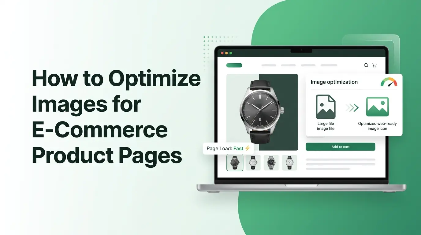
How to Optimize Images for E-Commerce Product Pages
Learn how to optimize images for your e-commerce product pages. Boost your page speed, improve user SEO rankings, and increase your online sales today.
Imagine walking into a physical retail store where the lights are dim, the display shelves are dusty, and it takes ten minutes for a clerk to bring a single item from the back room. You would probably turn around and walk right out the door. In the digital shopping world, a slow website with poorly managed pictures creates that exact same bad experience. Online shoppers have incredibly short attention spans, and they expect your website to load almost instantly.
When a customer visits your online shop, your product photos do the heavy lifting because buyers cannot touch, feel, or try on your merchandise. They rely entirely on what they see on their screens to make a purchase decision. High-quality visuals build an immediate emotional connection and give shoppers the confidence to click that buy button. However, those gorgeous, high-resolution pictures often come with massive file sizes that can slow your website down to a crawl.
This deep dive guide will teach you exactly how to find the perfect balance between beautiful visual presentation and lightning-fast page performance. You will discover the practical strategies, tools, and technical adjustments needed to handle your store graphics like an absolute expert. Whether you run a small boutique hobby shop or manage a massive digital store with thousands of items, these optimization techniques will help you transform your website into a fast, user-friendly sales machine.
Why Image Optimization Matters for E-Commerce
Every single second matters when it comes to keeping a digital shopper engaged on your website. If your product pages take longer than three seconds to display, you are likely losing a massive portion of your potential income to faster competitors. Let us explore the core reasons why adjusting your online store graphics is one of the smartest investments you can make for your business success.
Better User Experience
A fast website makes shopping fun, smooth, and completely stress-free for your visitors. When your product photos load seamlessly as a user scrolls down the page, it creates a sense of professional polish that makes people want to stay longer. They can browse through different colors, view distinct angles, and explore your collections without facing annoying lag or broken image icons.
Mobile shopping now makes up a huge percentage of all online retail traffic worldwide. Mobile users are frequently browsing on the move, sometimes using unstable cellular connections or older smartphones. Massive graphics eat up their cellular data plans and cause mobile browsers to freeze up entirely. By shrinking your files down to a reasonable size, you ensure that every customer gets a stellar browsing experience, regardless of the device they use.
Higher Conversion Rates
Clear, crisp product visuals build an instant layer of trust between your brand and a stranger on the internet. When a customer can see the fine stitching on a leather wallet or the exact texture of a ceramic mug, they feel much more comfortable spending their hard-earned money. If your pictures are blurry because of bad compression, shoppers might assume your actual products are cheap or unreliable.
When your website loads fast, your bounce rate naturally drops. The bounce rate is the percentage of visitors who leave your site after viewing only one single page. If a collection page takes forever to show up, people will hit the back button before they even see what you are selling. Fast pages keep people moving through your checkout pipeline, which directly translates to more completed sales and fewer abandoned shopping carts.
SEO Benefits
Search engines like Google care deeply about how fast your website performs. Google wants to send its searchers to helpful, quick, and highly functional websites. If your pages drag slowly because of heavy unoptimized files, search engines will push your rankings down below your faster competitors. Good media management keeps your site competitive in the modern search landscape.
Optimizing your pictures also unlocks a massive flood of traffic from image search results. Many online shoppers start their buying journey by looking through search tabs for specific styles, colors, or product designs. If your item photos are properly prepared and labeled, they can rank at the top of these visual search results, bringing highly motivated buyers straight to your online storefront.
Google measures user experience using specific metrics called Core Web Vitals. These metrics track how quickly the main content on a page appears, how fast the site responds to user clicks, and how stable the layout is while loading. Heavy graphics are almost always the main culprit behind poor Core Web Vitals scores. Cleaning up your media library fixes these hidden technical issues and satisfies search algorithms.
Choose the Right Image Format
Choosing the wrong file extension for your product pictures can quietly destroy your website performance. Each format handles data compression differently, so you need to match the specific type of graphic with the ideal file type to get the best results.
JPEG
The JPEG format has been the traditional backbone of internet photography for decades. It is highly reliable, universally supported by every web browser in existence, and exceptionally good at handling complex color gradients. This makes it the absolute best choice for standard product photographs, lifestyle shots, and colorful background graphics.
JPEGs use a clever compression method that discards tiny details that the human eye cannot easily notice. This allows you to shrink a large camera photo down to a tiny fraction of its original size without making it look pixelated or cheap. It is the safest default choice for the vast majority of your standard store items.
PNG
PNG files are fundamentally different because they support transparent backgrounds. If you want to place a crisp product shot on a colorful website background without a blocky white box around the item, PNG is the format that allows you to do it. It also preserves sharp lines and fine text perfectly.
The main downside to PNG files is that they are usually much larger than JPEGs. Because they preserve every single pixel of data perfectly, a complex photo saved as a PNG can easily be five times larger than it needs to be. You should generally restrict PNG usage to simple logos, isolated graphic icons, and clean product shots that absolutely require a see-through background.
WebP
WebP is a modern graphic format developed by Google specifically to make the internet run faster. It offers incredibly advanced compression technology that can make your files significantly smaller than traditional JPEGs and PNGs while keeping the exact same visual quality. It even supports transparency, combining the best features of older formats into one single package.
An increasing number of top-tier e-commerce platforms now automatically convert uploaded files into the WebP format. Switching your online store over to WebP is one of the easiest ways to shave weight off your pages instantly. It drastically reduces your total bandwidth usage and speeds up load times for almost all your store visitors.
AVIF
AVIF is an exciting new kid on the block in the world of online media. It provides even better compression efficiency than WebP, allowing you to compress a digital image down to an incredibly lightweight size without ruining the fine details of the shot. It represents the future of high-performance web design.
The only real catch with AVIF right now is browser compatibility. While modern web browsers support it, some older devices and legacy software programs still cannot read AVIF files properly. Many advanced web setups solve this problem by serving AVIF to modern devices while keeping a backup JPEG file ready for older systems.
Use the Correct Image Dimensions
Many beginner store owners make the mistake of uploading raw photos straight from a digital camera or a high-end smartphone directly onto their product pages. These raw files often feature massive physical dimensions, sometimes measuring over five thousand pixels wide. Your website layout will only display those pictures inside a small box that is a few hundred pixels wide, meaning the browser has to waste time downloading a giant file just to scale it down on the fly. You must resize your graphics manually or automatically before you ever hit the upload button.
Product Gallery Images
Your main product gallery images should be uniform, clear, and perfectly sized to fit your store theme. For most modern e-commerce platforms, a dimension of twelve hundred pixels by twelve hundred pixels is the sweet spot. This provides a clean square aspect ratio that looks balanced on both desktop computers and mobile screens.
Keeping your physical dimensions consistent across every single item creates a beautifully organized catalog. If one shoe photo is a tall rectangle and the next shoe photo is a wide horizontal shape, your product pages will jump around awkwardly as customers click through the images. Consistency builds a professional look that reassures your customers they are buying from a reliable business.
Thumbnail Images
Thumbnails are the tiny preview images that appear on your main collection pages, search results, and mini shopping carts. Because these pictures are physically small on the screen, they should have much smaller file dimensions to match. A thumbnail usually only needs to be around two hundred to three hundred pixels wide.
If your collection page displays twenty products, and each product uses a massive full-sized gallery graphic scaled down by code, that single collection page will take ages to load. By using dedicated, lightweight thumbnail files for your catalog grids, you allow customers to scroll through your inventory quickly without experiencing slow loading screens.
Zoom Images
If your store theme features a magnifying zoom effect that lets shoppers hover over an item to inspect the fine details, you will need a larger file to support that feature. For high-quality zooming, a dimension of two thousand pixels on the longest side is generally recommended. This gives the zoom script plenty of extra detail to reveal when a customer moves their mouse over the material.
To keep your site fast, make sure your system only loads that heavy zoom graphic when a user actually initiates the zoom action. Do not force the initial page load to download the massive zoom file right away. Keep the primary displayed image lightweight, and let the heavy lifting happen in the background only when requested.
Compress Images Without Losing Quality
Compression is the magical process of removing hidden structural data from a digital image file so it takes up less space on your web hosting server. Think of it like vacuum-packing a bulky winter blanket into a tight storage bag. The blanket takes up a fraction of the physical space, but it expands right back to normal when you open the bag to use it.
Lossy Compression
Lossy compression works by permanently discarding tiny bits of color data and visual detail that are naturally invisible to human eyes. It is an extremely aggressive and highly effective way to reduce file sizes. A quality compressor can often reduce a file size by eighty percent while leaving the photo looking completely identical to the naked eye.
When using a tool like an online Image Compressor, you can usually select a specific quality percentage slider. Setting your export quality between seventy and eighty percent is generally considered the perfect sweet spot for e-commerce websites. The file size drops off a cliff, but your customers will still see a beautiful, clean product photo on their screens.
Lossless Compression
Lossless compression takes a completely different approach. It does not delete any of the actual visual pixel data from the photo. Instead, it optimizes the internal file code and strips out hidden metadata, such as the camera model used, the date the picture was taken, and the GPS coordinates of the photoshoot location.
Because it does not alter the actual visual pixels, lossless compression will never reduce the clarity or crispness of your graphics. The trade-off is that the file size savings are much smaller compared to lossy methods, usually only saving around ten to twenty percent. It is best used for corporate logos or highly technical diagrams where absolute, mathematical perfection is required.
Finding the Right Balance
Optimizing your online storefront is always a delicate game of balance between beautiful visual presentation and lightning-fast page loading performance. You want your jewelry to sparkle and your clothing textures to look perfectly sharp, but you cannot afford to let those visual details slow down your customer journey.
A good rule of thumb is to aim for a maximum file size of around one hundred kilobytes for your main product photos. If you can get them down even lower without introducing ugly pixelation or blurry artifacts, you should absolutely do so. Test your pages on your own phone after compressing them to ensure the items still look highly appealing.
Optimize Images for Mobile Shoppers
Mobile shopping is no longer an alternative option; it is the primary way the majority of people browse the internet and buy goods today. If your online store is not optimized for a smooth mobile experience, you are essentially leaving a massive mountain of money on the table.
Responsive Images
Responsive image technology allows your website to automatically detect the exact screen size of the device your customer is using. The website code then selects and serves the perfect file size from a pre-made list of options. A desktop computer gets the larger file, while a small smartphone gets a much smaller version.
This prevents a mobile user from wasting precious cellular data downloading a massive desktop-sized asset that their tiny phone screen cannot even fully display. Most modern website building platforms handle responsive image generation automatically behind the scenes, but you must make sure your store theme fully supports this crucial feature.
Mobile Performance Tips
To give your mobile shoppers the best possible experience, try to minimize the number of decorative graphics, icons, and massive banners on your mobile layout. Keep the mobile design clean, minimalist, and hyper-focused on the actual product inventory. This naturally reduces the total page weight and speeds up performance.
Always test your e-commerce store using a throttled mobile network connection on your computer or phone. This simulates what a customer experiences when they are trying to buy from your shop while riding on a train or sitting in a coffee shop with spotty public internet. If your pages load quickly under those tough conditions, you know your media optimization is working beautifully.
Improve SEO with Image Optimization
Search engine optimization is not just about writing long blog posts and stuffing text keywords into your website headers. Properly managing your site media plays a massive role in helping search engine bots understand exactly what you are selling, allowing them to index your store accurately.
Write Descriptive File Names
When you save your product photos on your computer, never leave them with generic default titles like IMG_48291.jpg or product-shot-final.png. These random letters and numbers tell search engine algorithms absolutely nothing about the actual contents of the file. You are missing out on a massive organic traffic opportunity by ignoring your filenames.
Instead, write clean, highly descriptive names using simple English words separated by basic hyphens. Think about what a customer would actually type into a search box to find your specific item. Let us look at a few clear examples of how to rewrite your titles for the best possible search engine performance.
| Bad File Name | Good File Name |
|---|---|
| DSC_0012.jpg | mens-leather-running-shoes-black.jpg |
| product11.png | ceramic-coffee-mug-with-handle.png |
| final_version.jpg | organic-cotton-baby-blanket-blue.jpg |
| shoe_shot.webp | waterproof-hiking-boots-brown.webp |
Add Alt Text
Alt text is a short piece of descriptive text written directly into your website code that describes what is happening inside an image. It serves a vital accessibility role by helping visually impaired shoppers who use screen-reading software to understand your store layout. It bridges the gap between visual design and text-based browsing.
Search engine bots also use alt text to accurately read and classify your media files. When writing alt text, be specific, describe the item naturally, and avoid cramming random keywords into the sentence. A great alt text example would be: A woman wearing a red wool winter coat while standing in the snow.
Use Structured Data
Structured data is a special type of hidden code that you add to your website to give search engines organized background details about your retail items. When you use proper product schema markup, you can feed search bots exact details like your current price, item availability, customer review scores, and specific product photos.
This allows search engines to display rich snippets directly inside regular search results. When your product shows up on a Google results page with a star rating, a clear price tag, and a beautiful thumbnail photo attached to it, your click-through rate will skyrocket because your listing looks incredibly trustworthy and official.
Implement Lazy Loading
Lazy loading is an incredibly smart web performance technique that instructs a web browser to hold off on downloading images until they are actually needed. Instead of forcing a computer to download every single picture on a long product page all at once, the browser only fetches the files that are currently visible on the screen.
What Is Lazy Loading?
When a customer lands on your product page, they initially only see the content at the very top of the screen. This area is called the above-the-fold view. With lazy loading turned on, the browser quickly downloads the logo, the main product photo, and the checkout button so the page becomes functional within milliseconds.
The remaining pictures further down the page, like customer review photos, related items, and detailed lifestyle banners, are replaced with lightweight invisible placeholders. As the shopper scrolls down the page, the browser fetches those deeper assets right before they enter the user's field of view. The customer experiences a seamless, unbroken scroll, while your website enjoys a massive boost in loading speed.
Best Practices
While lazy loading is an absolute lifesaver for long web pages, you must apply it carefully to avoid accidentally hurting your user experience. Never apply lazy loading to the very first image that appears at the top of your product pages. Your main product photo needs to appear immediately, so it should always bypass lazy loading rules.
If you lazy load your primary above-the-fold media, your visitors will be forced to stare at an awkward blank space or a spinning loading icon for a second when the page first loads. This creates a strange sense of visual lag that makes your site feel unpolished. Save the lazy loading behavior strictly for items that live below the fold.
Common E-Commerce Image Mistakes
Even experienced online business owners often fall into easy traps when managing their website media galleries. Being aware of these common slip-ups will help you avoid making the same costly mistakes on your own digital storefront.
Graphic Design Pitfalls
- Uploading massive files directly from professional cameras without resizing them first
- Using random aspect ratios that make your catalog grid look messy and disorganized
- Neglecting mobile device layouts by using desktop-only image configurations
- Forgetting to write clear alt text and leaving filenames as meaningless random numbers
- Overloading a single product listing with thirty separate high-resolution pictures
When you load up a single listing with too many heavy files, you create a massive bottleneck for your web servers. Shoppers rarely look through dozens of identical angles of the same item anyway. Stick to a handful of stunning, high-quality, perfectly optimized shots that show off the most critical features of your merchandise.
Image Optimization Checklist
To help you stay completely organized while upgrading your digital storefront, use this practical step-by-step checklist every single time you prepare new media for your online inventory.
- Pick the ideal file format for the job, using JPEG for standard photos and WebP for advanced modern site performance.
- Resize the physical dimensions of your product shots to a standard size like twelve hundred pixels square before uploading.
- Run your files through a high-quality compression tool to drop the final file weight down below one hundred kilobytes.
- Rename your files using clear, descriptive English words separated by simple hyphens instead of random letters.
- Write natural alt text for every single upload to guarantee great web accessibility and boost your image search visibility.
- Verify that your website theme has lazy loading enabled for all media that lives below the primary display screen.
- Run your product pages through free speed testing tools regularly to monitor your performance and fix hidden lag.
5 Frequently Asked Questions
1. What is the ideal image size for e-commerce products?
The ideal physical dimension for most standard online product pages is twelve hundred pixels by twelve hundred pixels. This balanced square shape works beautifully across all desktop layouts and mobile phone screens. For the digital file size weight, you should always try to keep your files under one hundred kilobytes to ensure rapid page load times.
2. Should I use WebP for product images?
Yes, you should absolutely transition your store over to the WebP format if your e-commerce platform fully supports it. WebP provides significantly superior compression algorithms compared to older traditional formats, allowing you to cut your file sizes down by up to thirty percent more than standard JPEGs without losing any visible clarity.
3. How many product images should a product page have?
A great product listing usually features between four and seven high-quality photos. This gives you plenty of room to showcase the item from different angles, display close-up details of the craftsmanship, and include a few real-world lifestyle shots. Avoid uploading dozens of repetitive pictures, as this will only slow down your page speed.
4. Does image optimization improve SEO?
Yes, media optimization is a massive factor for search engine optimization. By shrinking your files, you directly speed up your website loading times, which satisfies Google's core ranking requirements. Furthermore, writing descriptive file names and accurate alt text allows your products to rank high inside visual search results.
5. Can image compression affect image quality?
Yes, if you compress your files too aggressively using lossy methods, it can introduce blurry artifacts, pixelated edges, and distorted colors. However, if you use a high-quality compressor and keep your export settings around seventy to eighty percent quality, you can drastically reduce file sizes while keeping the visual change invisible to the human eye.
Wrapping Things Up
Mastering the art of online media management is one of the absolute best ways to elevate your e-commerce business, boost your search engine traffic, and keep your customers happy. By taking the time to carefully select the right file formats, resize your dimensions, compress your data, and implement smart layout techniques like lazy loading, you create a lightning-fast shopping experience that naturally turns casual website visitors into loyal paying customers.
Do not treat graphic optimization as a single one-time task that you complete and forget about forever. Make it a regular habit to conduct comprehensive media audits of your online catalog at least once every few months to catch oversized files or broken assets. Finding that perfect sweet spot between gorgeous visual presentation and blazing-fast site performance will give your business a massive competitive edge in the busy digital marketplace.
Related Articles
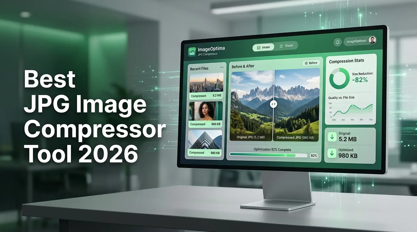
Best JPG Image Compressor Tool 2026
Speed up your website today with our free JPG image compressor. Easily reduce large photo file sizes without losing quality at multicompressor.com.
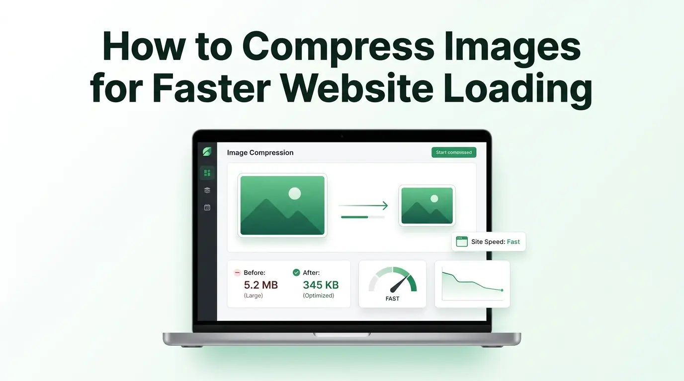
How to Compress Images for Faster Website Loading
Learn how to use an online image compressor to speed up your website. Reduce your bounce rates, boost mobile performance, and improve your search rankings.
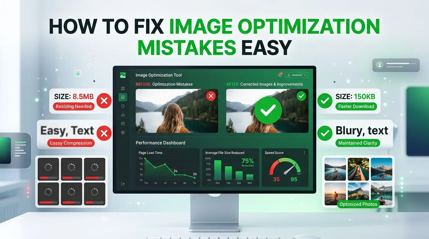
How to Fix Image Optimization Mistakes Easy
Are heavy photos ruining your site speed? Learn the top ten image optimization mistakes you must avoid to keep visitors happy and boost SEO rankings.